DZone
Thanks for visiting DZone today,
Edit Profile
  • Manage Email Subscriptions
  • How to Post to DZone
  • Article Submission Guidelines
Sign Out View Profile
  • Post an Article
  • Manage My Drafts
Over 2 million developers have joined DZone.
Log In / Join
Refcards Trend Reports
Events Video Library
Refcards
Trend Reports

Events

View Events Video Library
  1. DZone
  2. Refcards
  3. Responsive Web Design
refcard cover
Refcard #276

Responsive Web Design

The line between mobile and web development is more and more blurred, and new web apps have to adapt to any new devices or screens. In this Refcard, learn the basics of responsive design to help your app reach the most users possible.

Free PDF for Easy Reference
refcard cover

Written By

author avatar John Vester
Senior Staff Engineer, Marqeta
author avatar Lisa Smith
Front End Developer, Spoonflower
Table of Contents
► Layout Options ► Relative Font Units ► Responsive Images
Section 1

Layout Options

Responsive web design is the process of ensuring that web content looks good on any device from handheld to widescreen — designing so the content responds to the available viewport instead of remaining fixed to a specific dimension. Since more than half of all web traffic is now mobile, making sure your site looks good on a variety of devices is crucial to reaching the entirety of your audience.

A device’s viewport is the number of pixels available in either portrait or landscape view. You can see an extensive list of viewports by device at http://viewportsizes.com/ and determine the viewport of the device you are currently using at http://viewportsizes.com/mine/. Knowing the precise viewport dimensions of a device isn’t as important as building a site that can scale no matter the dimension. To do that, a variety of techniques and methods are combined including a variety of layouts, relative fonts units, and responsive images.

Selecting a layout option is typically a core design that is made at the start of a web design initiative. The primary layout options are: fixed, fluid, responsive, and adaptive.

Fixed

The fixed layout option, commonly referred to as the static layout option, establishes a hard-set value for the size of the layout. This approach was popular years ago when web designers wanted to assure that a given layout was an exact size.

The problem with this approach is that devices with a resolution smaller than the fixed layout size were forced to scroll in order to fully use the application. Conversely, those with larger screen resolutions found themselves with a large amount of unused space around the application.

Image title

Fluid

The fluid layout option is similar to the static option, but the static values for the size of the layout are replaced with a percentage.

The fluid approach provided a better experience for devices that had a larger resolution, but those devices with a smaller resolution still had usability issues. As an example, if the layout consisted of two panels, one rendering 33% of the screen and the other rendering 67%, the items in the smaller panel may become unusable when the screen resolution falls below the resolution needed to display the data in the template.

Image title

Adaptive

With web designers realizing that fixed and fluid layout options both provide challenges to providing a pleasant user experience, the concept of adaptive layout options was created.

An adaptive layout option determines the resolution or type of device making the HTTP request and routes to an appropriate web design template. As an example, users on devices with low screen resolutions might route to a product-list.html file in a folder dedicated to such devices. Meanwhile, users with high resolution desktop computers would route to a product-list.html file in another folder.

With the adaptive approach, several different template versions can exist to accommodate a wide-range of devices. The major drawback to this approach is the additional time and resources required to design, test, and maintain several versions of the same template information.
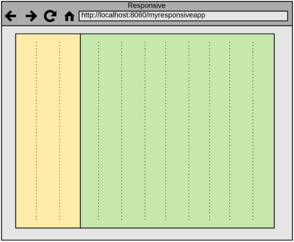
Responsive

Learning from the challenges presented in the fixed, fluid, and adaptive layout options, the responsive approach provides a solution that accommodates a wide range of screen resolutions without having to duplicate the effort across multiple template files.

A responsive layout option breaks the screen into multiple segments. Then, as the screen resolution changes, the segments adjust programmatically – readjusting on the fly. As a result, when the user on a high-resolution desktop resizes the browser window to a fraction of the monitor’s available space, the website still renders in a usable state.

With the dominance of Bootstrap and Google Material Design, a responsive web design has become an expectation for web-site consumers – knowing they can load a site on their desktop or smart devices without a compromise in usability.

Image title

Section 2

Relative Font Units

One of the most important aspects to any form of communication is the ability to render text in a readable way. For web design, this translates to the font that is being used. However, one of the biggest challenges is how to best size fonts within a web project.

Currently, font sizing options are classified as relative font units, with options for: pixels, em, rem, percent, viewport units, and fluid typography.

Point

Long before responsive web design was concept, the idea of using points as a size reference was popular in typography and other forms of publishing. The standard behind points is that one point is equal to 1/72 of an inch.

Points are fixed in their size, which presents similar challenges with static layout options – they are not scalable and do not respond to responsive web design view ports. A simple example is displayed below:

html {
    font-size: 12pt;
}

Pixel

As computers became mainstream, the concept of pixels was introduced – referring to the size units being displayed on the computer screen. The standard behind pixels is that one pixel is equal to one dot on a computer monitor. Pixel-based designs became popular to render web documents with a pixel-perfect presentation.

Like points, pixels are fixed in their size and present the same challenges as point-based designs. A simple example is displayed below:

html {
    font-size: 12px;
}

Em

To address the challenges with pixel font units, em was introduced to provide a scalable solution to pixel font units. Basically, em are scalable units employed by the browser to compute pixel font units. Consider the following CSS example:

html {
    font-size: 12px;
    padding: 2em;
}

When the html tag is rendered, the font-size would be set to 24px, which is the product of 12 (px) x 2 (em).

In taking this approach, em allows legacy pixel technology to be utilized, but in a manner that is scalable and adaptable to responsive web design.

Rem

With respect to font units, the rem approach is similar to the em approach – introducing a manner to determine pixel-based sizes in a responsive design. The logic is the same as the em example above:

html {
    font-size: 12px;
    padding: 2rem;
}

Again, when the html tag is rendered, the font-size would be set to 24px, which is the product of 12 (px) x 2 (rem).

Em vs. Rem

Based upon the examples above, there is no difference between em and rem with respect to relative font units. Where a difference can be noted is when multiple layers of em-based styles are introduced – since em employs inheritance with all parent objects.

On the other hand, rem is only relative to the html (root) font-size. A simple way to remember this key difference is to think of rem being the root-only version of em. With this distinction in place, web designers typically implement em over rem.

Percent

As one might expect, percent-based font units are displayed based upon the percentage of another element’s property. This is similar to the em approach. The percent approach scales the size based upon a parent object. Consider the following example:

html {
    font-size: 12px;
}

body {
    font-size: 200%
}

In the example of above, text in the <body> tag of a web page will be rendered as 24px, or 200% of the size of the parent html (root) setting.

Viewport Units

With the viewport in place within a responsive application, the option exists to set the relative font unit based upon the viewport’s size. This is referred to as viewport units. The following options are available:

  • 1vw = 1% of viewport width
  • 1vh = 1% of viewport height
  • 1vmin = 1vw or 1vh, whichever is smaller
  • 1vmax = 1vw or 1vh, whichever is larger

In the following example, the 3.4vw setting would yield a font size of 17 with a viewport width of 500. (500 x 0.034 = 17)

html {
    font-size: 3.4vw;
}

Fluid Typography

Fluid Typography builds upon the viewport approach, allowing computations to exist within the CSS structure. Consider the following CSS configuration:

body {
    font-size: calc(12px + (20 - 12) * ((100vw -- 500px) / (1500 - 500));
}

In the example above, the font size will range from 12px to 20px based upon view ports of 500px to 1500px. The benefit to fluid typography is the higher degree of resizing based upon the dynamic size of the viewport.

Section 3

Responsive Images

In responsive web design, the ability for images to be responsive is equally as important as the font units. However, based on the resolution of the client accessing the responsive web application, image quality can become an issue – such as important aspects of an image bering no longer easy to notice… or available.

max-width Attribute

The quickest and easiest approach to making sure an image responds to the size of the current container that will house the image is to use the max-width attribute in either the CSS or directly on the image tag:

<img src="myImage.png" max-width="100%">

The challenge with this approach is that the resolution of the image may not scale well as the size of the view area changes. Legacy browsers do not have an understanding of this attribute, which can make use of max-width a show-stopper.

Art Direction Challenges

A challenge worth noting with respect to responsive images is the concept of art direction. Art direction is making sure the focus or intent of the image is maintained as the responsive web design renders different viewport sizes.

Consider a photo of family celebrating the sunset on a beach. When the image is in full view, the setting sun appears off to the right, the family is in the middle of the frame, and the remainder of the image is populated with ocean, sand, and a darkening sky. Devices with smaller view resolutions may cause the setting sun to be gone, or not noticeable – with the size of the family shrinking to a portion that is no longer easy to identify. To the user, this may start to appear as a photo of the beach near dusk.

Another example might be an image that includes a map for an upcoming event. At higher resolutions, the user can become familiar with the location based on the included landmarks. However, at a lower resolution, it might be impossible to see anything on the map.

<img> With the srcset Attribute

One approach to provide a responsive design to images is to use the srcset attribute on the <img> tag. This is similar to the adaptive layout option described earlier. Based on the size of the container, different versions of the image are displayed. Here is an example:

<img src="small.png" srcset="bigger.png 750w, biggest.png 1500w">

As one might expect, this approach requires maintaining multiple versions of the image to handle varying device resolutions. Another challenge to this approach is that the browser client is not an ideal decision-maker when selecting the right version of the image to display.

<picture> Tag

Similar to the <img> tag noted above, the <picture> tag also allows multiple versions to be utilized, based on a given size. Here is an example:

<picture>
  <source media="(min-width: 1500px)" srcset="biggest.png">
  <source media="(min-width: 750px)" srcset="bigger.png">
  <img src="small.png" style="width:auto;">
</picture>

The challenge with the <picture> tag can also be browser support. Plus, there is the need to maintain multiple versions of the same image.

Open Source Solutions

There are open source JavaScript libraries that have been created to help address the challenge with responsive images.

Picturefill and HiSRC have been created to allow web designers more freedom with their responsive image design. These can be key solutions toward handling issues related to art direction.

For a server-side solution, Adaptive Images provides a solution that delivers the right image size based on the resolution of the device making the request. Using the server-side approach eliminates the need for any changes to be made on the web client tier.

Including these libraries in your project allows web designers the ability to maintain more control over responsive images to address art direction challenges.

Tooling

If you are a web designer working on a project without access to the original image creator, getting multiple image versions can be a challenge. In those cases, developers find themselves creating alternate versions of the image.

To make things easier, the Responsive Image Breakpoints Generator site can be utilized to generate the optimal resolution for responsive image sizes.

Simply navigate to the site, upload your initial image, then use the controls on the form to have the best version of your image created. Cloudinary has even introduced an API to generate images programmatically.

Like This Refcard? Read More From DZone

related article thumbnail

DZone Article

Enforcing Architecture With ArchUnit in Java
related article thumbnail

DZone Article

Creating a Web Project: Caching for Performance Optimization
related article thumbnail

DZone Article

Exploring Intercooler.js: Simplify AJAX With HTML Attributes
related article thumbnail

DZone Article

Agile’s Quarter-Century Crisis
related refcard thumbnail

Free DZone Refcard

Getting Started With Low-Code Development
related refcard thumbnail

Free DZone Refcard

JavaScript Test Automation Frameworks
related refcard thumbnail

Free DZone Refcard

Salesforce Application Design
related refcard thumbnail

Free DZone Refcard

E-Commerce Development Essentials

ABOUT US

  • About DZone
  • Support and feedback
  • Community research
  • Sitemap

ADVERTISE

  • Advertise with DZone

CONTRIBUTE ON DZONE

  • Article Submission Guidelines
  • Become a Contributor
  • Core Program
  • Visit the Writers' Zone

LEGAL

  • Terms of Service
  • Privacy Policy

CONTACT US

  • 3343 Perimeter Hill Drive
  • Suite 100
  • Nashville, TN 37211
  • [email protected]

Let's be friends: